Crisp
Crisp aims to bring companies closer to their customer. We helped them with various design work over the years.
Year
2017What we do
Mobile App Design Illustrations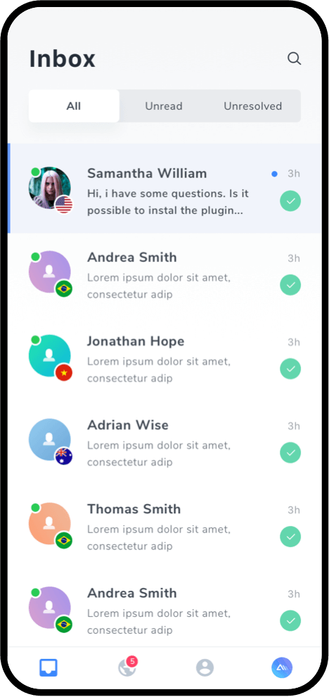
01
Initial
Discussions
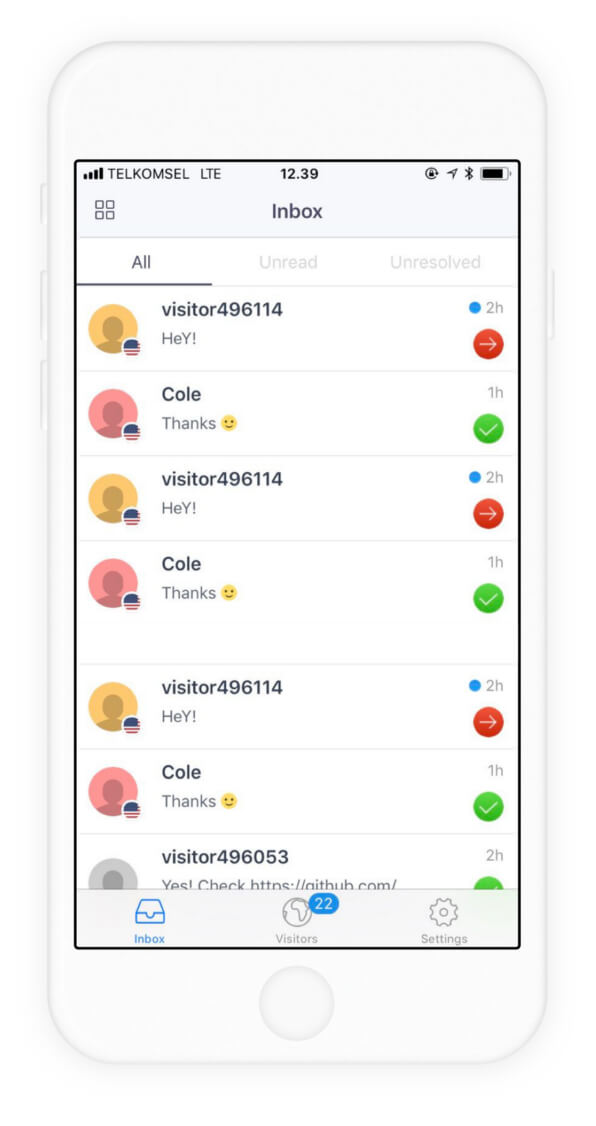
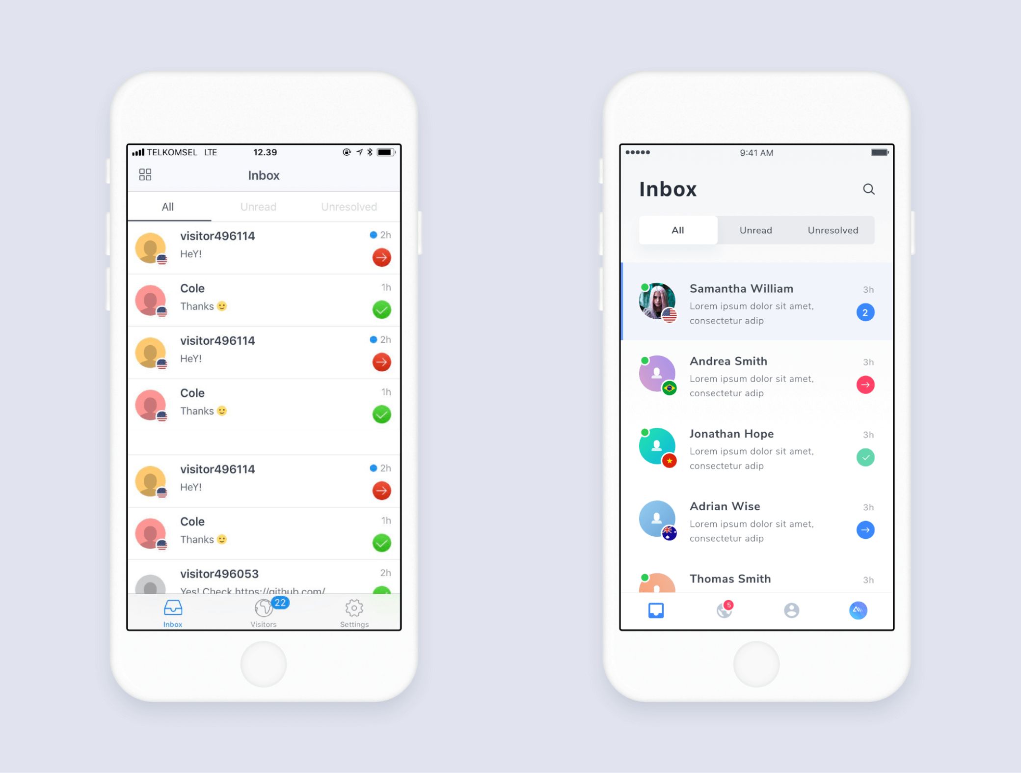
Crisp wanted to refresh their current UI design. Here are some of their old designs.
02
Exploration
We begin the design process with the discovery phase, exploring a design pattern that fits the client's expectations.
03
Implementation
We applied the design pattern to all Crisp screens based on the selected style.
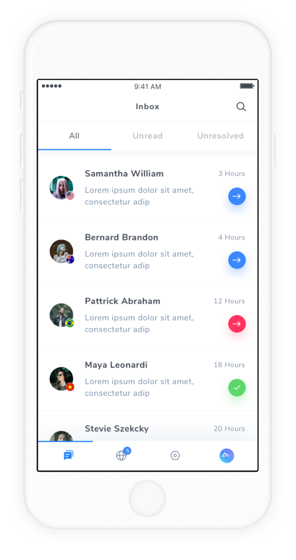
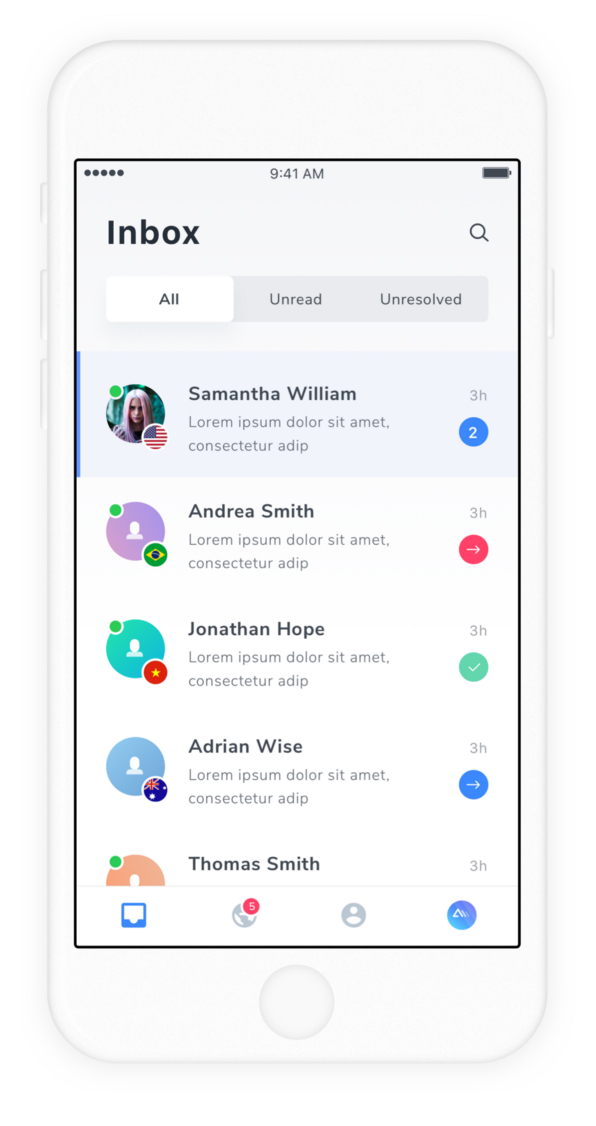
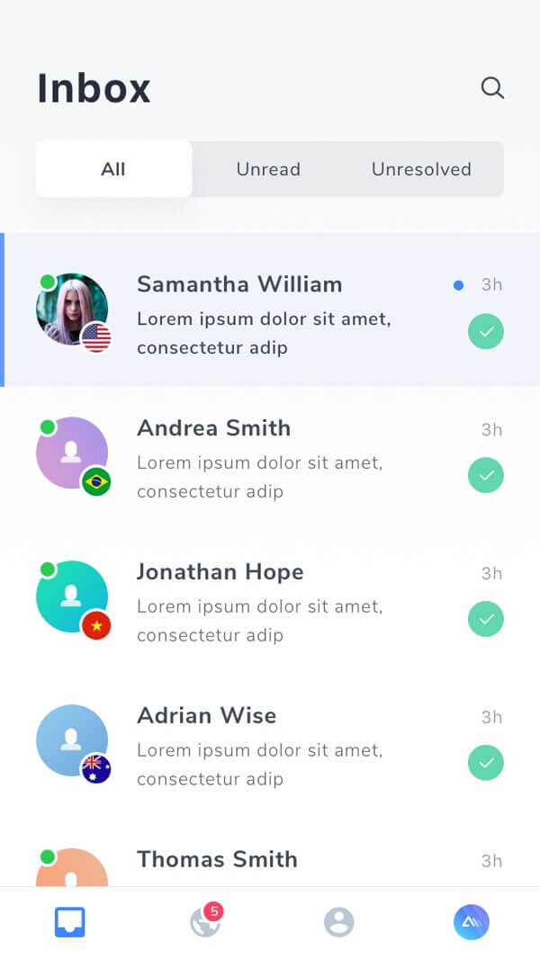
Home Screen
The tabs were emphasized by adding shadow to show dimension. The click areas were made larger for convenient navigation.
Bolder text aestheticized the design.
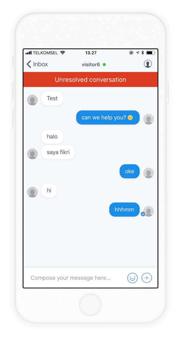
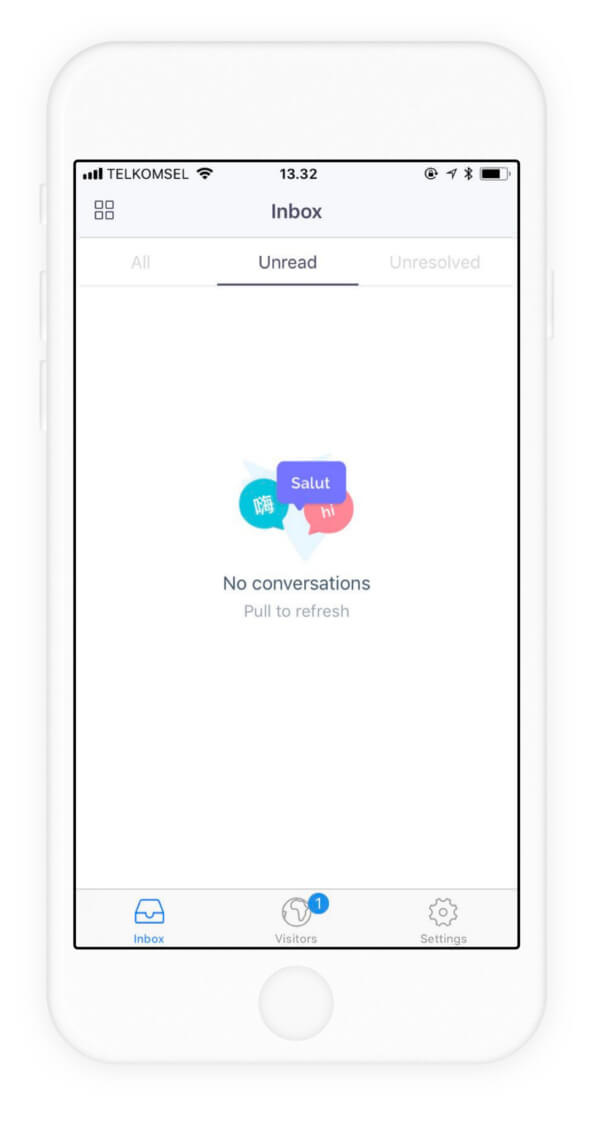
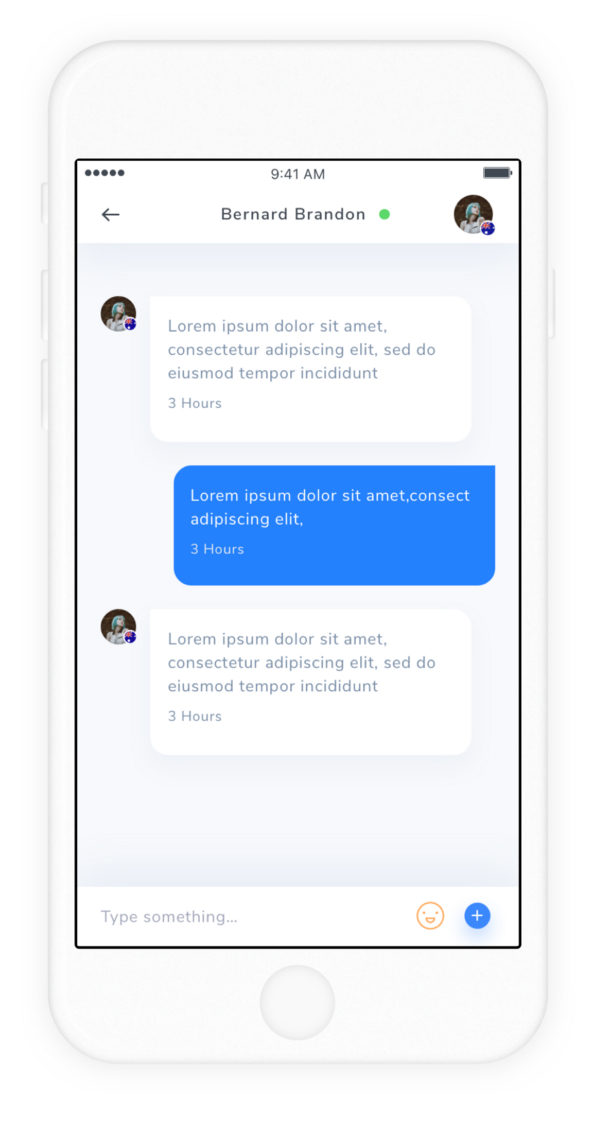
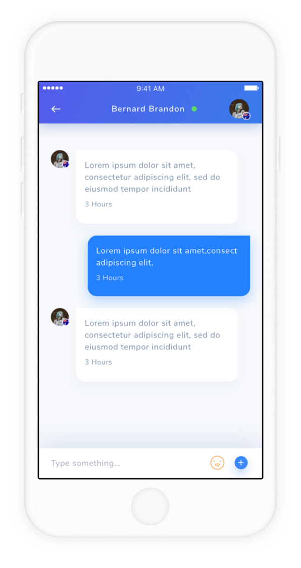
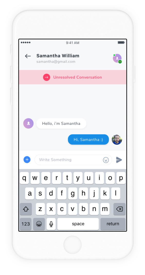
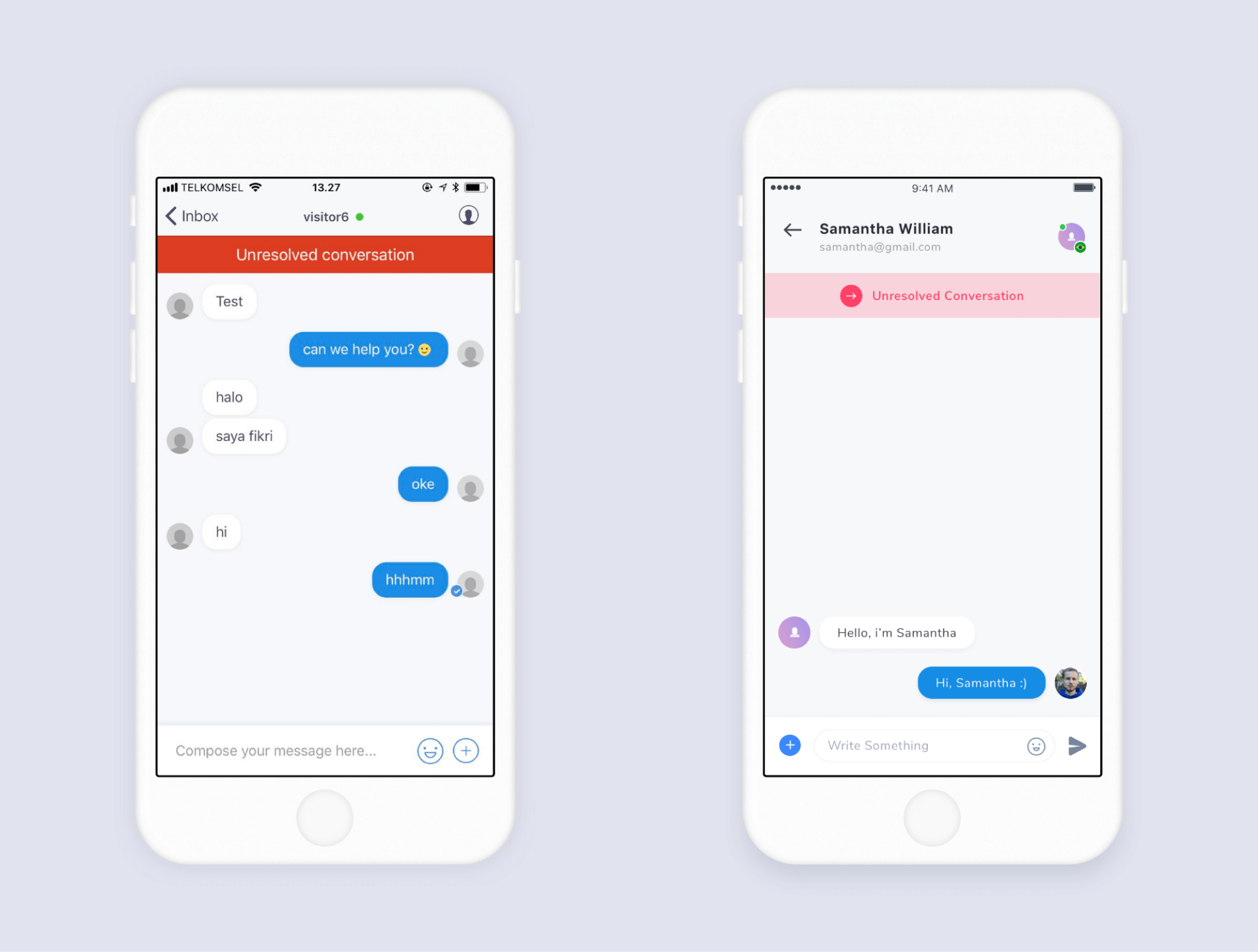
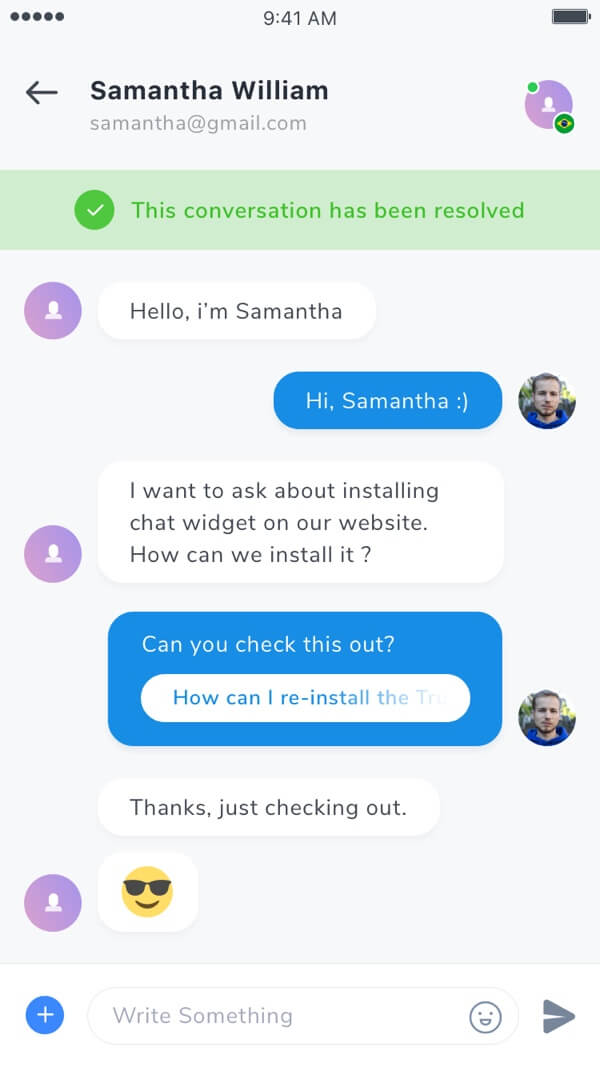
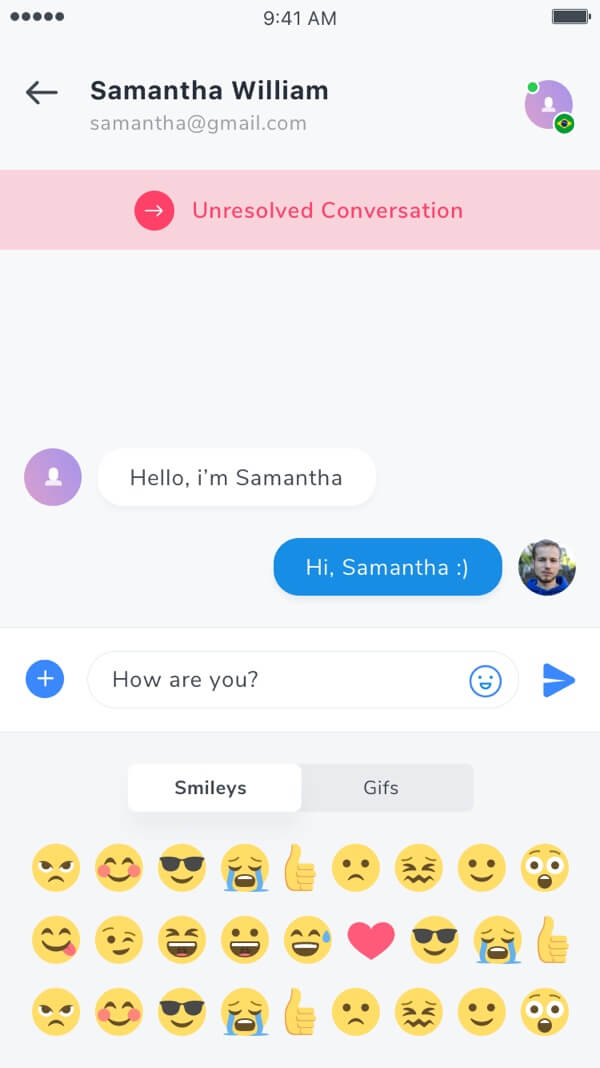
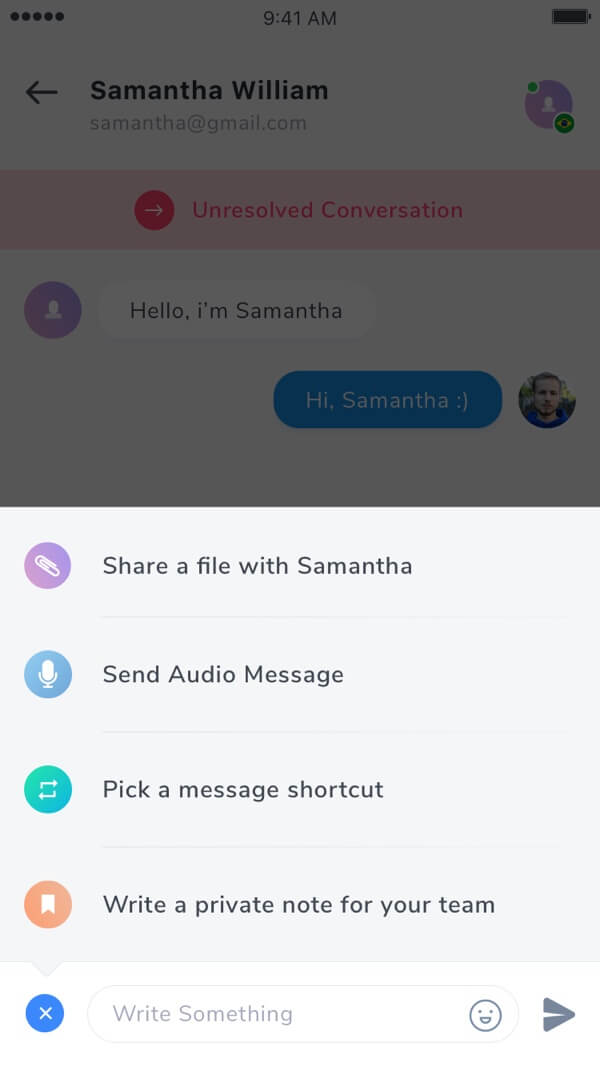
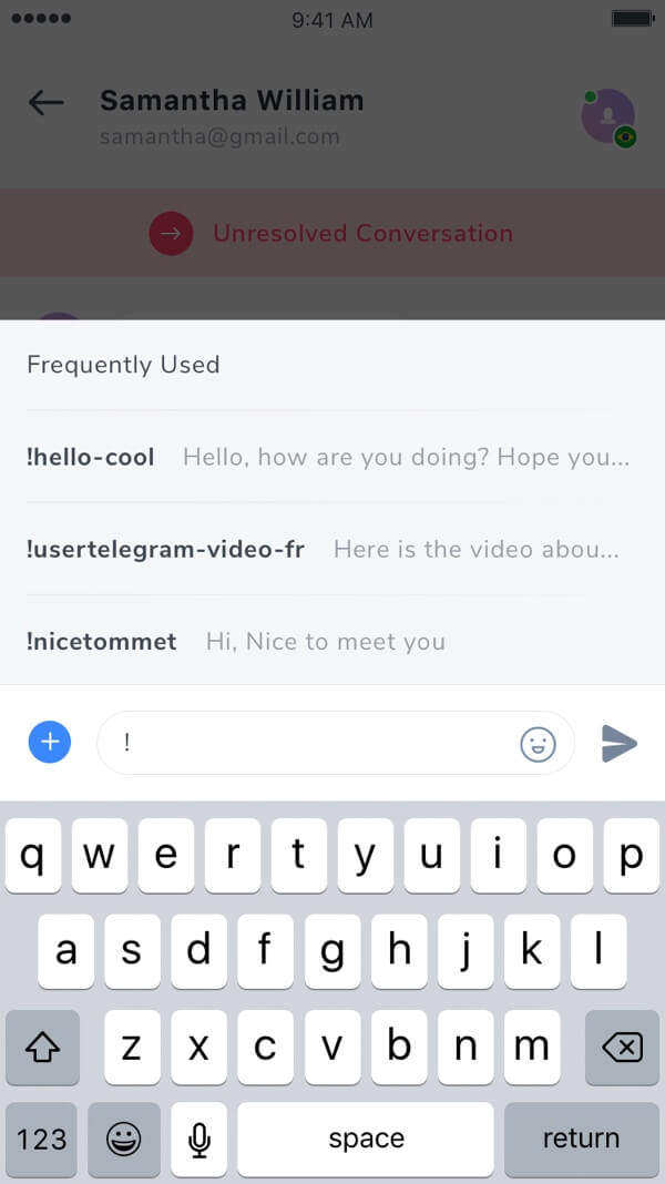
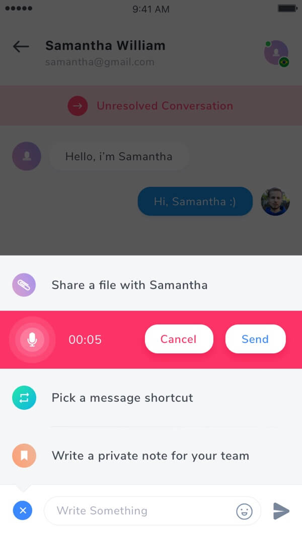
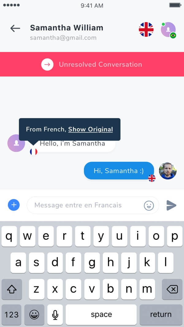
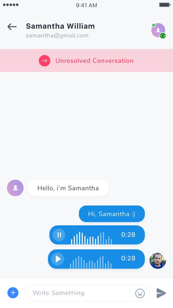
Chat Screen
We didn't make many changes on this page. The structure is maintained because it is already functioning effectively.
For this screen, subtle color adjustments were made to enhance the user experience. For example, we made the red to be less obtrusive and gentler to the eyes.
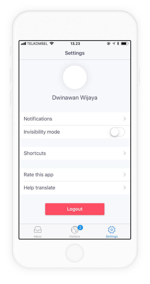
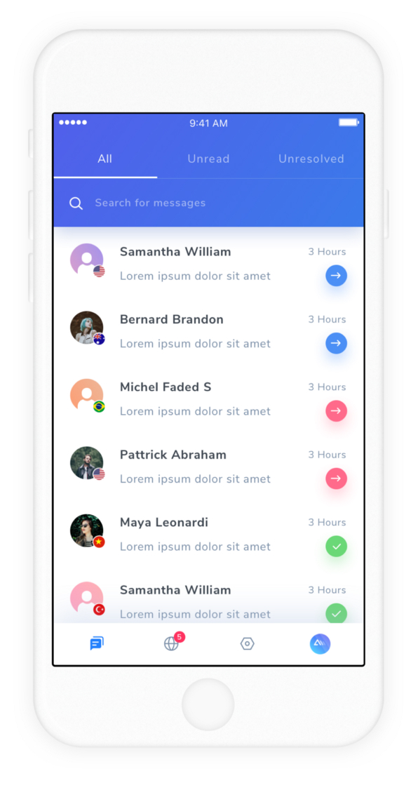
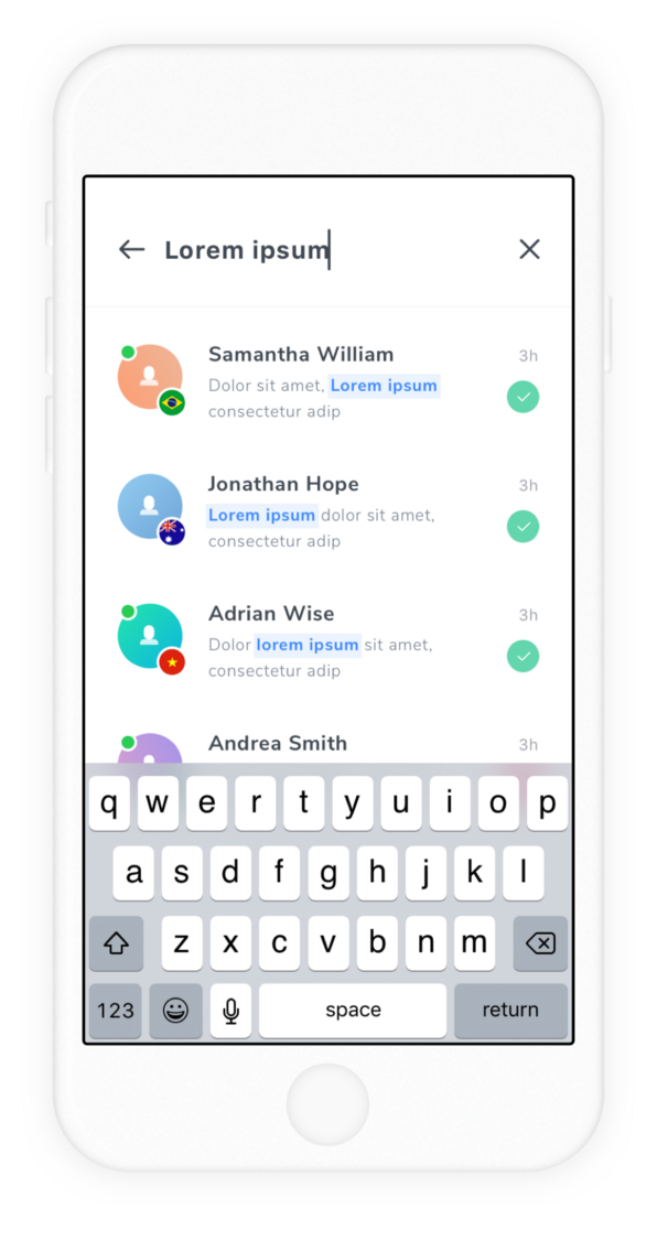
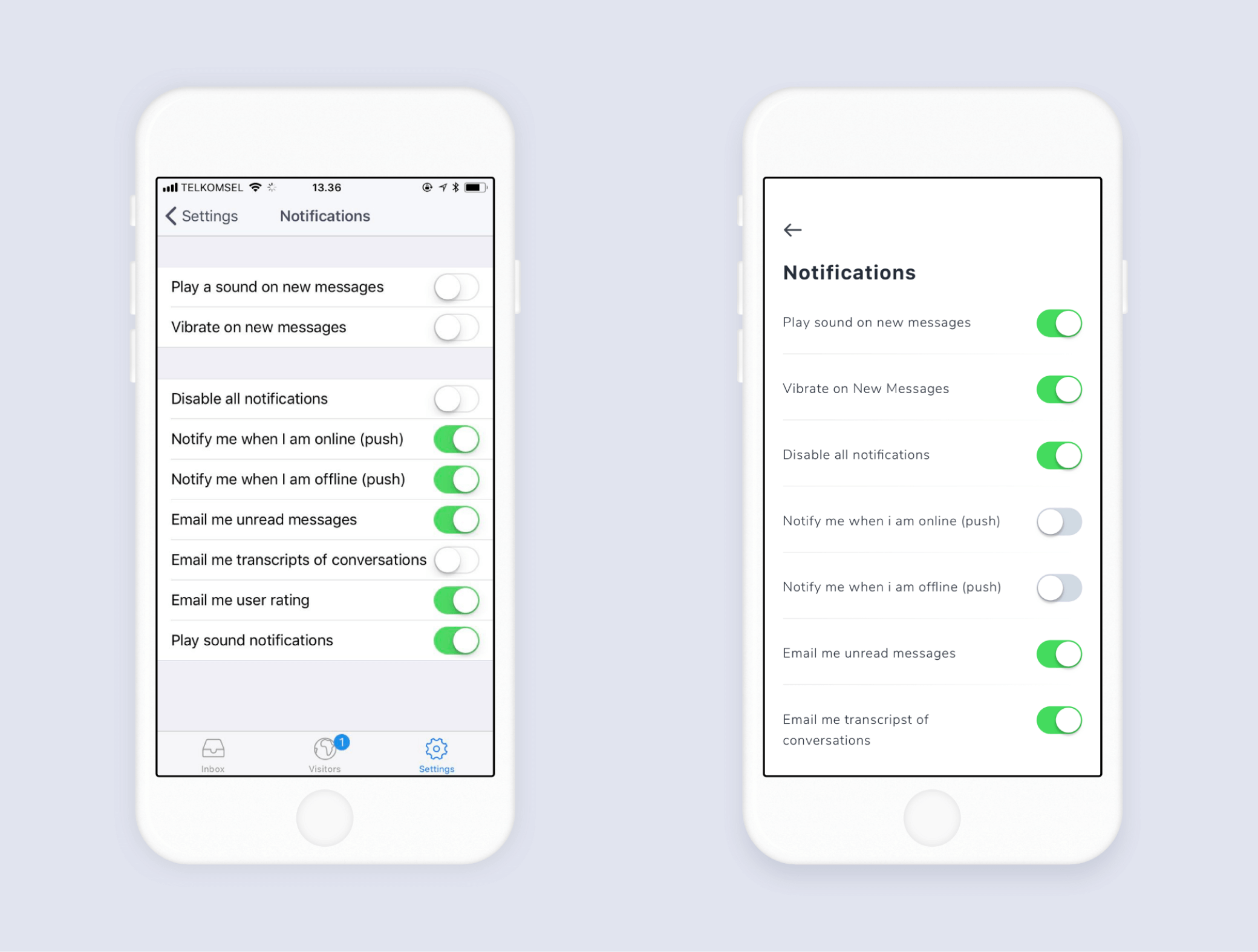
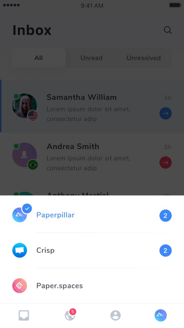
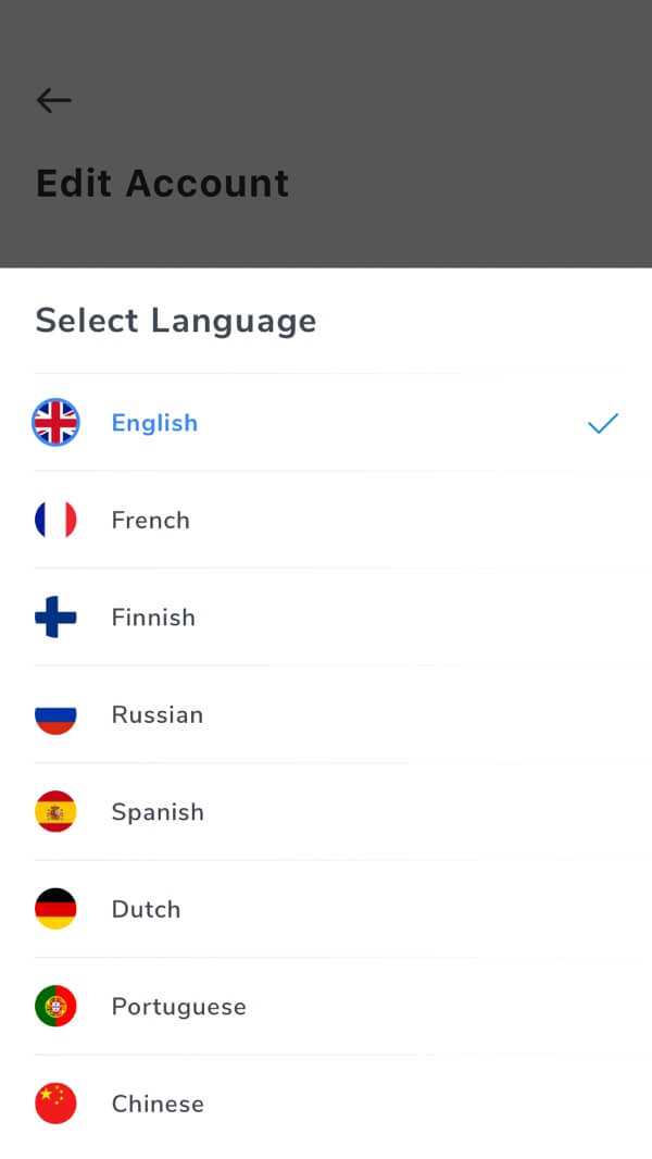
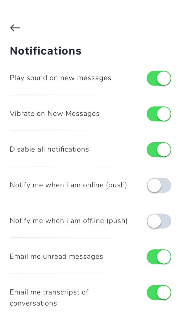
Notifications Screen
While keeping a structure similar to the old design, we applied a more generous whitespace for this page to make it easier to read and enrich the visual experience.
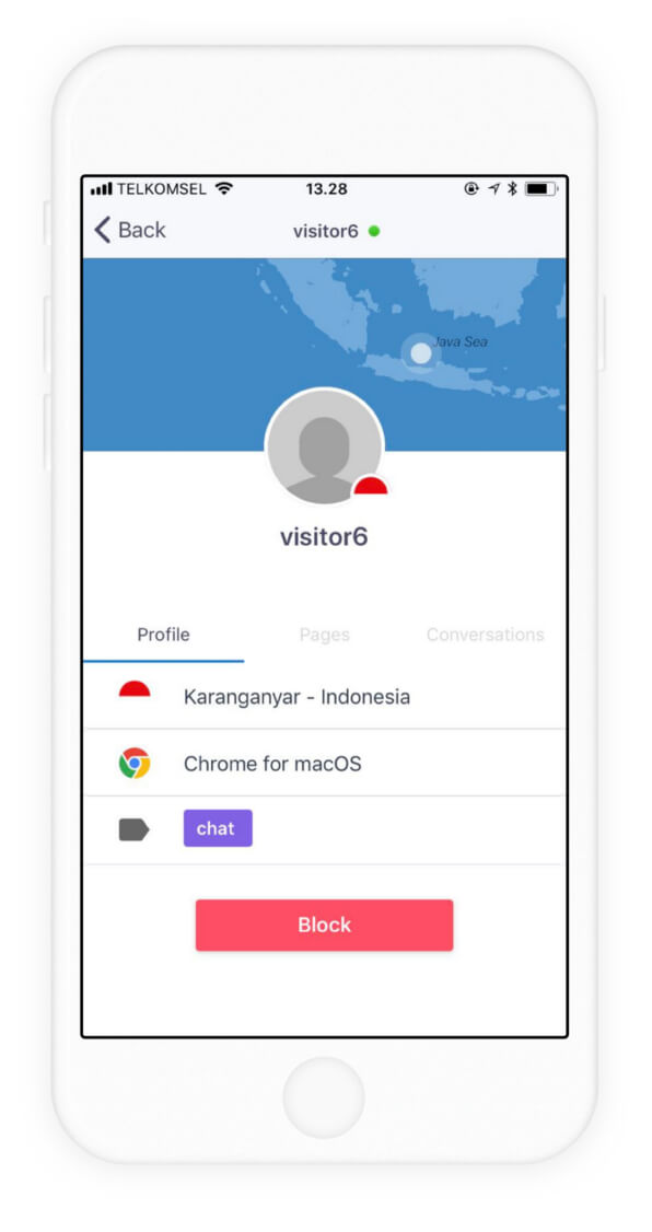
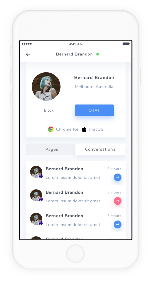
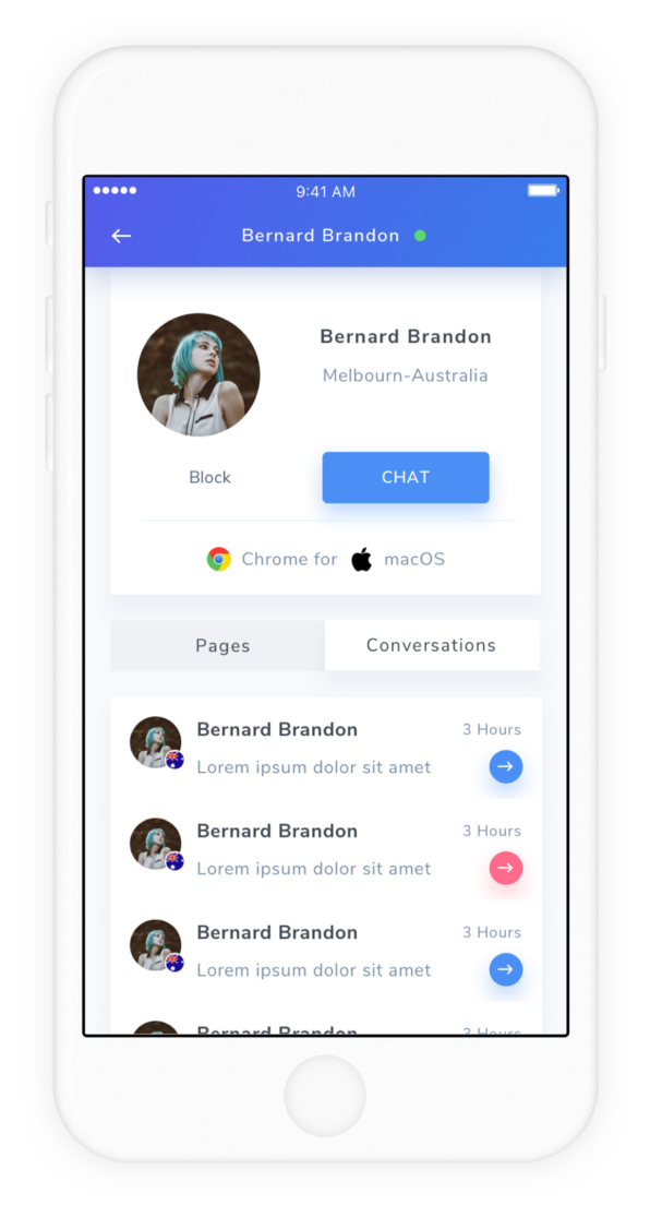
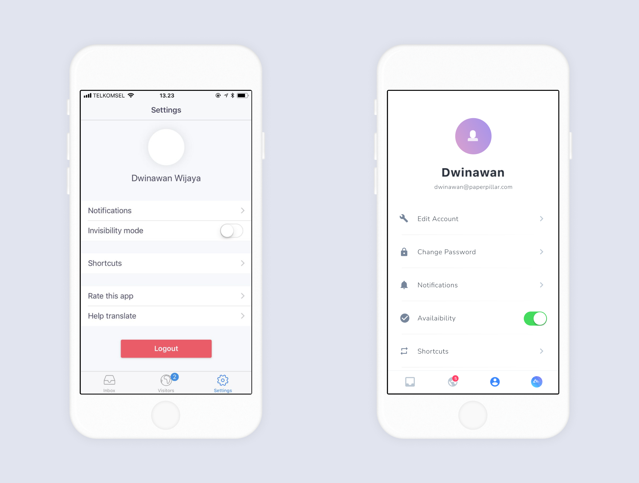
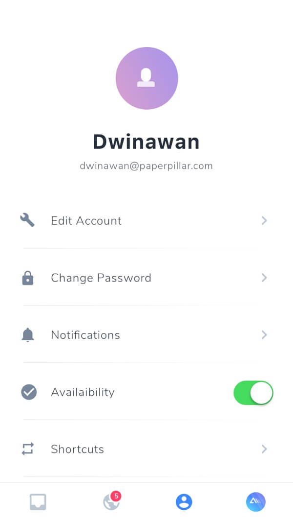
Profile Screen
Also, keeping a similar structure, we added more whitespace for this page and icons to help users navigate more quickly.
The availability function was moved closer to the navigation section to increase reachability.
04
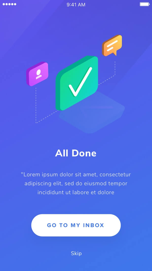
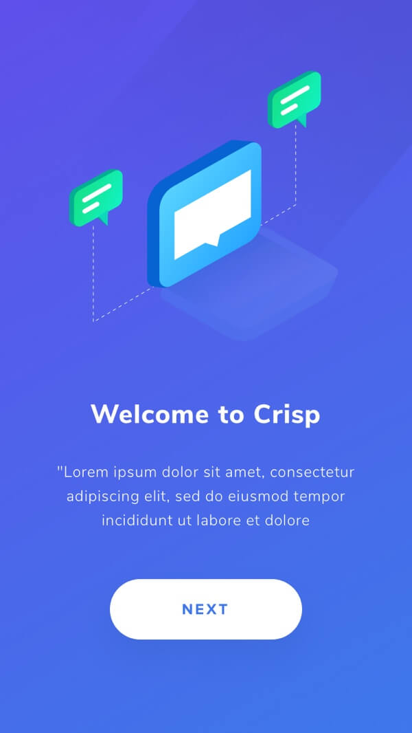
Cleaner and Bolder Design
These are the screens with the new design!
"We really appriciated their perfectionism"

Baptiste Jamin
CEO of CrispInterested to work with us?
 Shoot us an email to hello@paperpillar.com